Final Video: Version 4

I once again used Mechanical Turk to gather feedback on my video. Compared to the previous version, there seemed to be much less confusion about what’s going on, and how the watch works. With that in mind, I decided to stick with the sequential approach to the video.

This time around, I added the alarm function to the video, going through almost the same sequence as in the previous medium-fidelity prototypes. One thing I did change was move the alarm title and message screen to the front of the sequence. It seems to frame what the alarm is for better if there’s a title and message first, followed by location and time of alarm.

I’m kind of glad I waited to do the alarm functionality until after I was satisfied with how the video is going. While I’m getting faster at creating a scene in Blender, it still is a fair amount of work to make a set of images. On the other hand, I do feel like there are some slight ambiguities about how best to design the flow of setting an alarm. It might have been better to take the more complicated alarm and do that in place of the homing functionality, get all those iteration in, and add the homing functionality later since it’s much simpler.
Final Video: Version 4

Final Video Version 3

I posted version 2 of this video on Mechanical Turk for feedback. The watch functionality explanations seemed to be mostly clear, though the idea that the blue TARDIS indicator moves like a compass pointer was missed by more than one viewer. The almost unanimous confusing point in the video was the back story. I’d mostly borrowed the story from an 1970s era Doctor Who episode, “Spearhead from Space”, where I’d found the homing functionality of the Doctor’s watch. The story was a bit confusing to me, too, and I only found out what exactly happened by reading about Doctor Who elsewhere. While I tried to explain what was going on, the storytelling was still confusing, especially to those who weren’t familiar with the character.

Given that the story really doesn’t add anything at all to explaining the functionality of the watch, I completely removed the back story from version 3 of the video. Instead, I took the approach of explaining how the Doctor seems to never get lost, and always knows how to find his way back to the TARDIS. It seemed to solve a mystery to viewers, rather than create more confusing story points. The video is still too short, so I’ll add add the alarm functionality to the final video, taking the same explanatory approach, while detailing how the Doctor uses it.

Final Video Version 3

Final Video Version 2

Version 1 of the final video worked heavily off of the last story board. I used my own voice in a narrative story approach to the video. The video was made in PowerPoint, and while it was quite simple to use, I found that setting up the proper length to show the slides in time with my voice recordings was difficult to control. My method was to set the audio recording on each slide, which takes more clicks than necessary. Then, I recorded a slide show, manually advancing the slides as I recorded. I’m sure there’s a way to specify exact timing for each slide.

For version 2, I dispensed with PowerPoint, and sequenced the video in Blender, where I’d already made the slides. From what I’ve seen of iMovie and Windows Movie Maker, the interface is similar, but offers more control of effects like crossfades. It was relatively easy to use, and it took about the same amount of time to make as it did in PowerPoint.

Final Video Version 2

Inspiration: The making of the NYT’s Netflix graphic

This article gives an overview of various decisions the New York Times Graphics department made while designing the interactive graphic “A Peek into Netflix Queues“. The team started with data acquired from Netflix that gives the 50 most popular movies watched nationwide by zipcode. Given the volume of data, they decided to focus on a few major cities rather than try to cover the entire country.

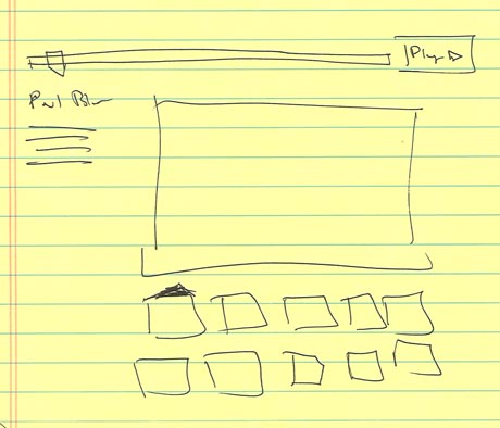
Designing the interface was the most difficult part, especially the navigation. The author of the article, Kevin Quealy, made at least 10 different mockups trying to solve this problem. Two other designers drew a sketch based on Quealy’s work.

first-netflix

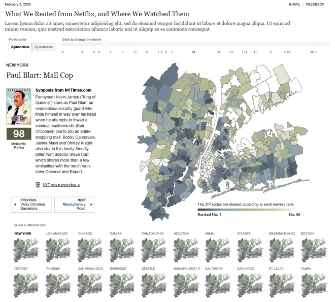
Then Quealy created a more refined drawing of it in Illustrator.

pictuwwre-1

Once they were satisfied with their design, they created gathered and compiled shapefiles for all the Zip Codes, gathered movie cover art and other assets, and started writing the code to glue it all together.

http://www.snd.org/2010/01/nyt-netflix-graphic/

Inspiration: The making of the NYT’s Netflix graphic